
TWEED
Rebrand for Canada’s best known cannabis brand.
Tweed was getting ready to launch into the US, as a grower and as bricks and mortar retail. The original identity had done its job. The next chapter needed something more engaging, more elevated and younger.
We led the rebrand from the creative director’s chair at Canopy Growth: logo and wordmark, colour and type, packaging architecture and the retail system.
Brand identity · Packaging · Retail · Creative direction
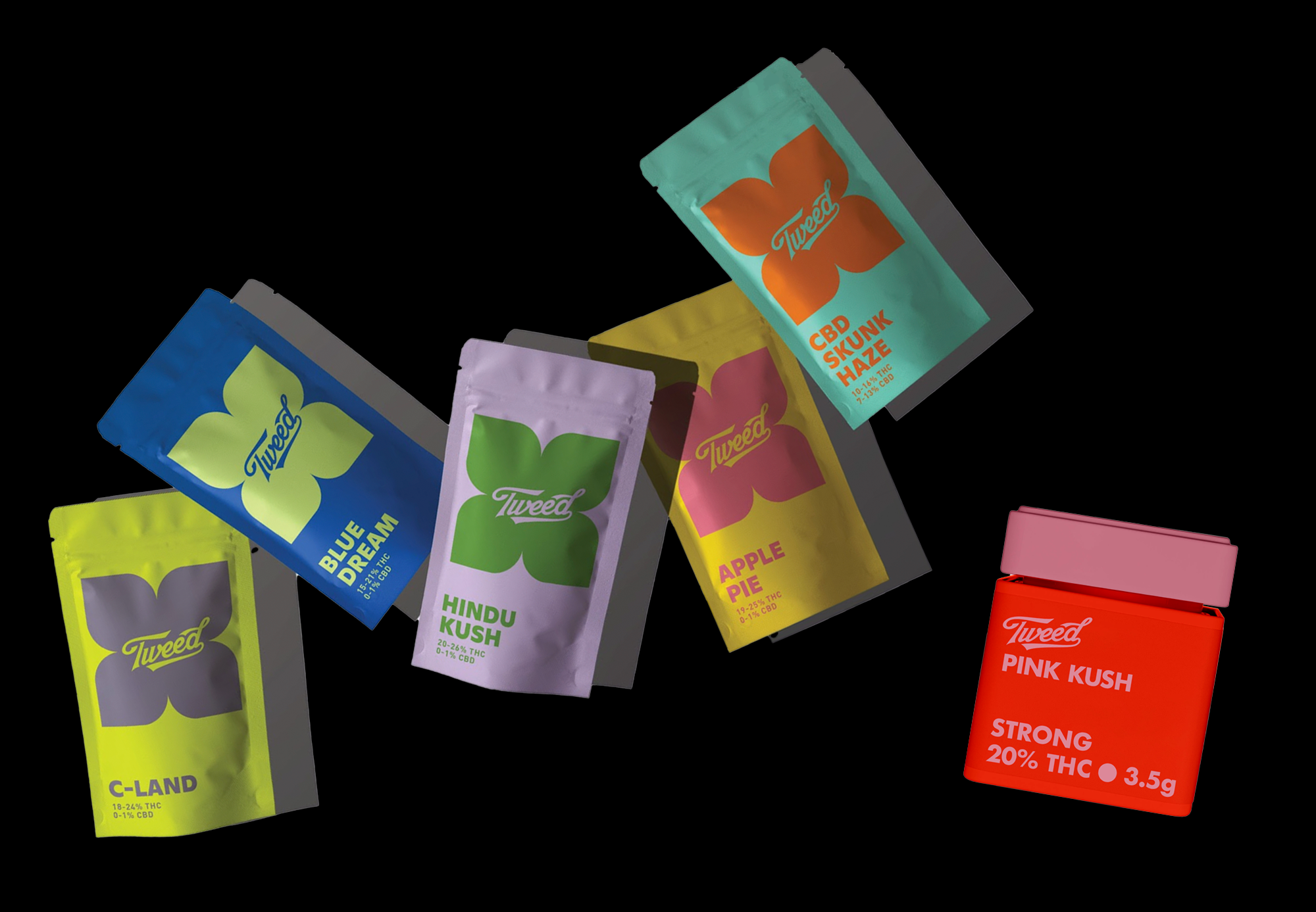

Fun, simple and consistent.
The new brand speaks to the everyday cannabis user who wants consistently good bud that is easy to choose, easy to understand and easy on the wallet.
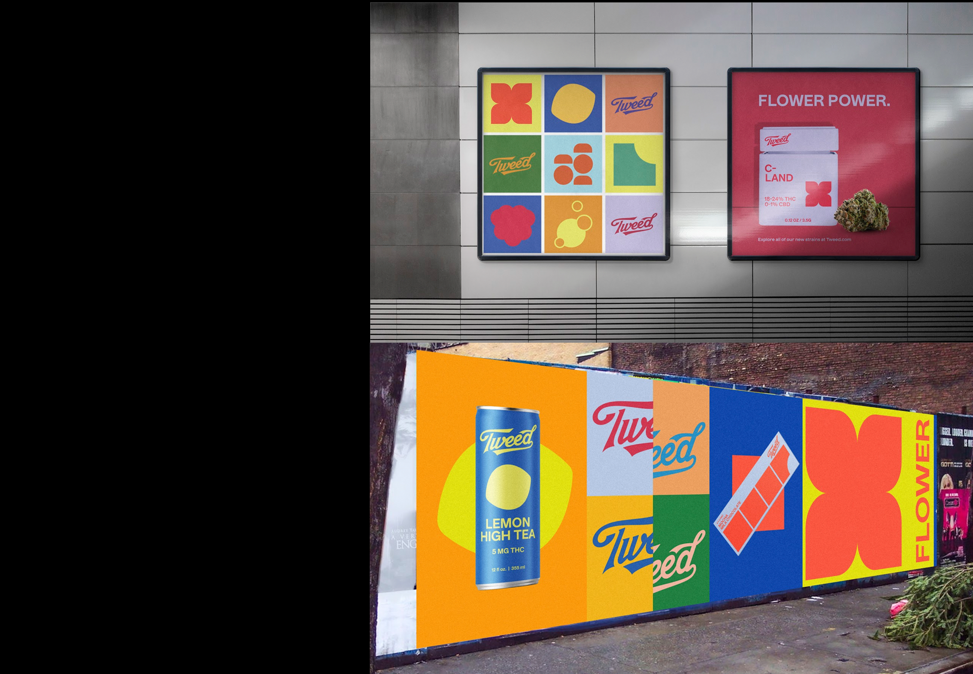
Colour does the sorting. Every strain and flavour gets its own palette inside one system, so the shelf reads at a glance and Tweed still has room to express flavour, strain and effect with real nuance.
One system, top to bottom.
The packaging architecture holds it together: pouches, jars, chocolate and seltzer, plus the pieces around them like trays, glassware, shipper boxes and staff badges. Same wordmark, same flower shapes, same bright colour, whatever the format.
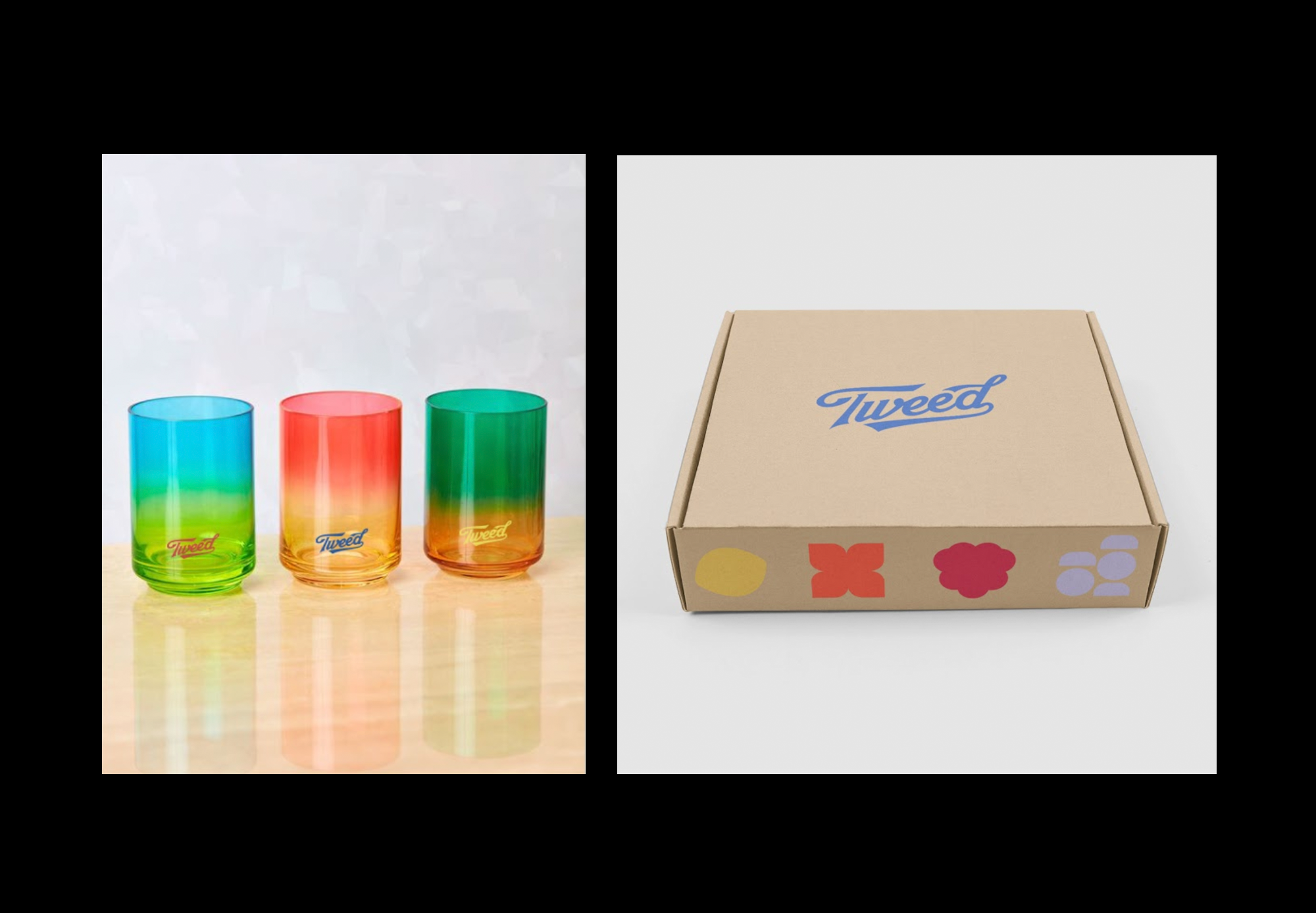

Seltzer, staff badges and the little things. A brand lives or dies on whether the small stuff feels like it came from the same place.
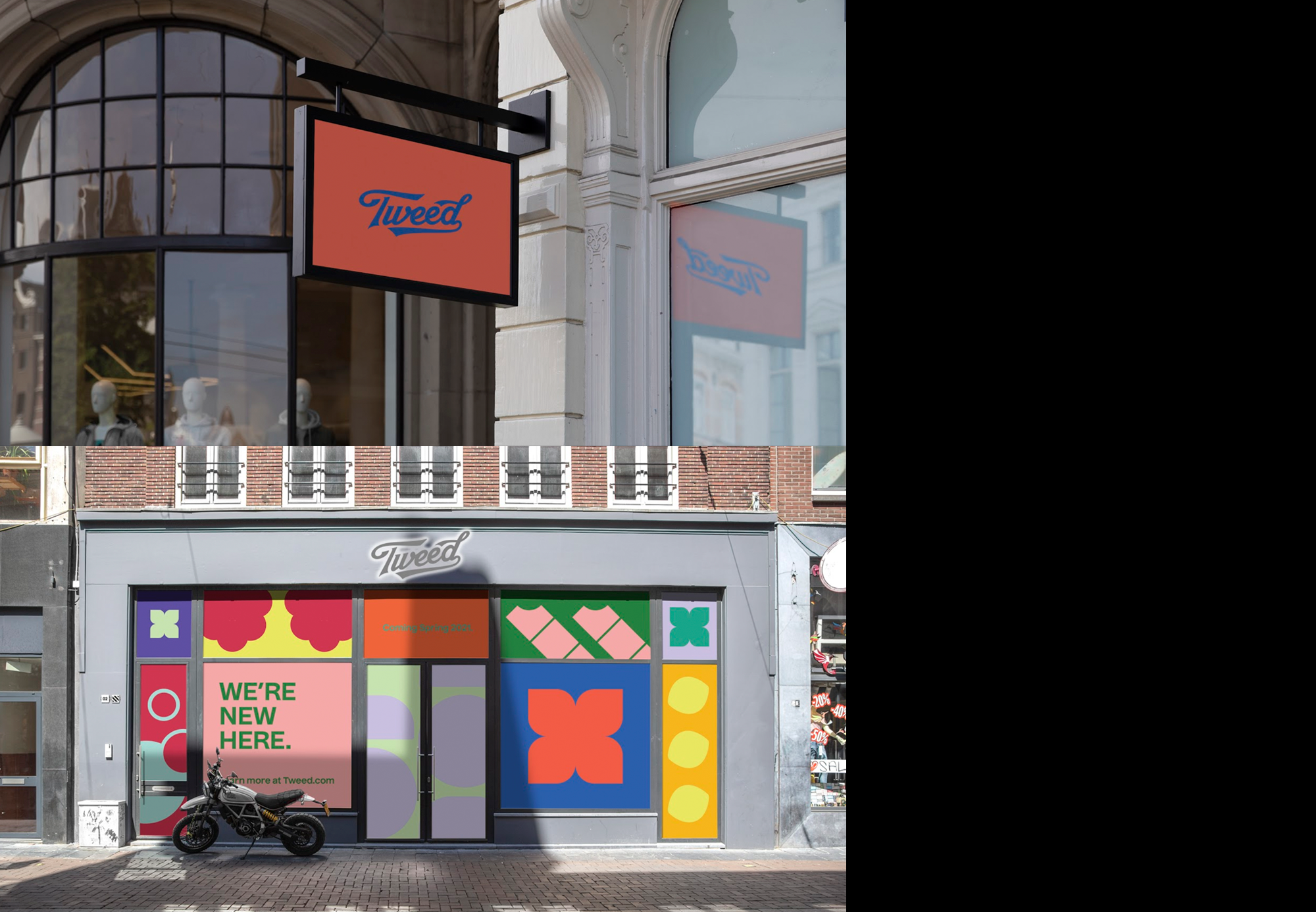
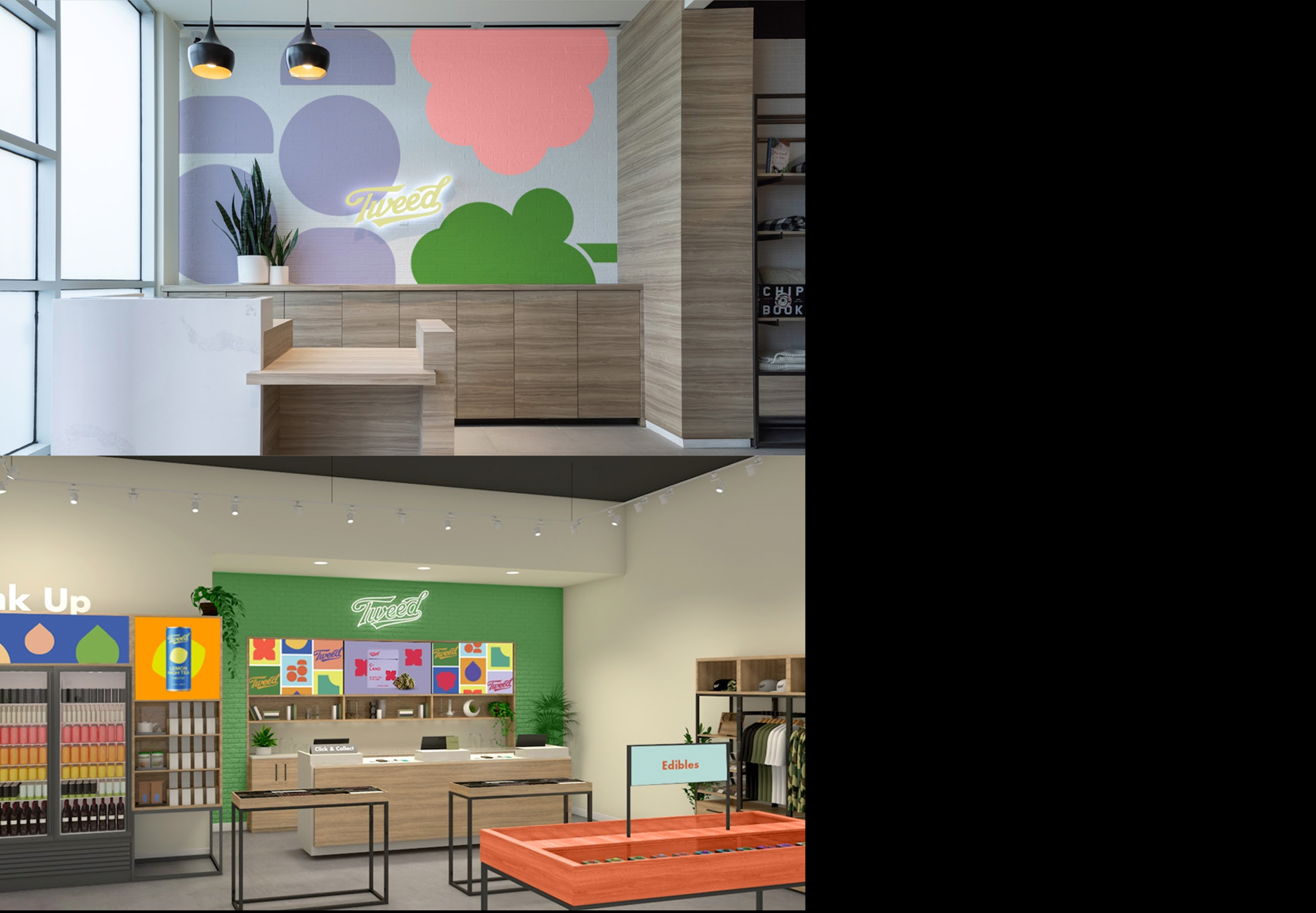
Then it walks out the door.
The retail system carries the same flower shapes and colour onto the storefront, the shop interior and out of home, so a Tweed store reads as a Tweed store from across the street.
Client: Canopy Growth.
Creative direction by Joel Tellier.
With Brett Ramsay, Ellen Micallef, Jen Dunaj and Jared Barter.
Want something like this? Talk to Joel →